

2023 is already here and you might be having a lot of plans and hopes for your business as a business owner in Australia.
Here’s why keeping your website up-to-date should be at the top of your list’s to-dos.
Localisation
Do you know why localization AKA designing your website for your target audience in terms of location, cultural norms, and demographics is important?
Because people are drawn toward familiarity and personalization. The more familiar a brand is to your cultural beliefs and norms, the more familiar you feel and the more likely you would explore the brand further and make purchases.
Localisation also reflects the language, currency, fonts,colours, images and videos you use in your website.
Minimalism
Some of the top characteristics of minimalist web design are
But what does minimalism mean for your website?
The purpose is to minimise the website to its most necessary elements removing the unnecessary items. In a world where the user, the customer is in the centre stage, businesses are moving towards pleasing the customers from the get-go until the final phase of the buying cycle and more.
That is why resource simplification is important for websites and applications handling online customers that conveniently reduce the functional and visual overload, giving a seamless experience for the end users.
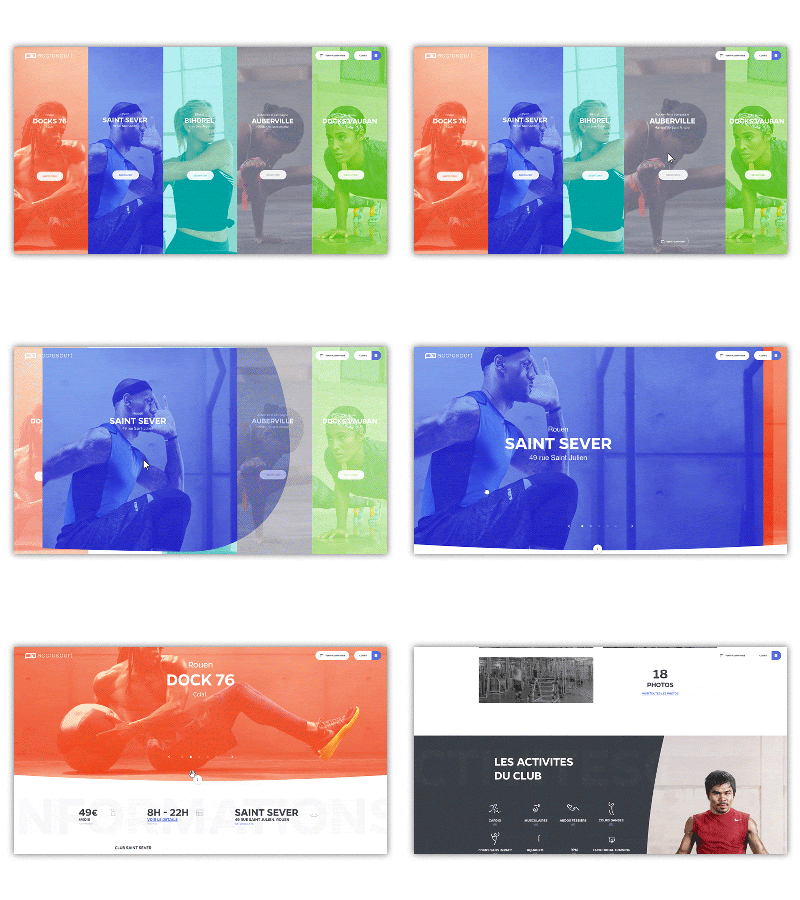
Animated Web-Design

Let’s first not confuse web animation with cinema animation. We are not talking about Frozen, Minions, or Ice Age here, but rather UI, CSS & javascript animation.
Motion and web animation are becoming more popular in web design, where brands use them in images, sign-up blocks, buttons, and many more.
The purpose is to be more eye-catching and keep the users of your website longer.